Why Marketers Should Use Dashboards
With all of the data available to marketers, it’s hard to figure out what’s useful and what’s not. All of the customer relationship management (CRM) tools provide immense amounts of data. Google Analytics and Facebook reports also show tons of data. The problem is weeding out the useful information or seeing the information in a way that helps you understand what actions you need to take.
Dashboards allow you to see data in a way that quickly answers the questions you have. Those answers help you take the right action. Compared to built-in analytics reports, dashboards do a better job of helping you see the data that matters, which helps you make decisions about your marketing.
Dashboards Versus Analytics
Dashboards help you see answers to your specific questions, whereas analytics allow you to dig into details. To illustrate, you might build a dashboard that shows the customer’s journey through your sales pipeline and lets you break down that information by traffic source. Your dashboard will do that task incredibly well, but it won’t answer questions you didn’t design it to answer.
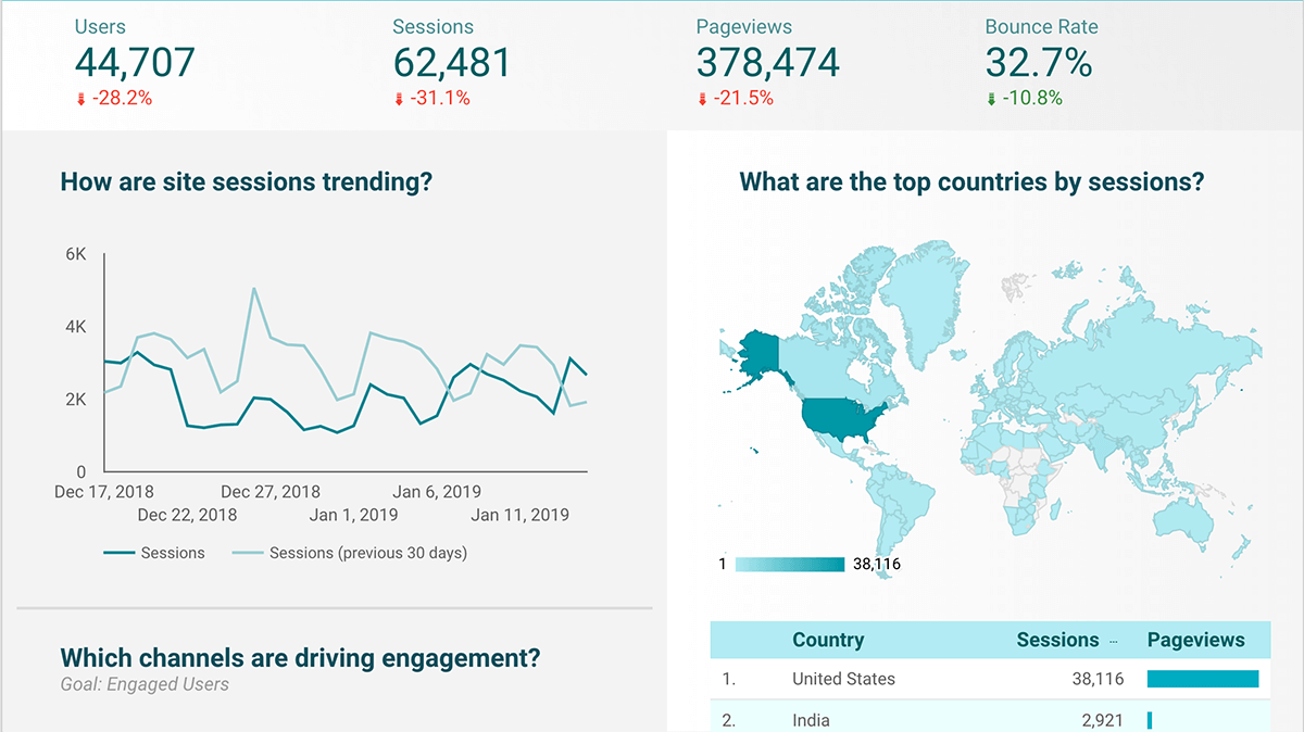
Say you want to know how many people in your sales pipeline are using Apple devices. If you didn’t build the dashboard to answer that question, it can’t help you. Your analytics might be more helpful in answering that question because you can build a report that shows the information going through your sales pipeline and create a segment for the people who use Apple.
In other words, dashboards aren’t a great tool for a deep dive into your data, but that’s also why dashboards are useful. In analytics, everything seems to contradict something else. It’s difficult to determine what the numbers mean or whether you can trust the numbers you see. However, dashboards curate these numbers so you avoid the overwhelming nature of analytics.
The time it takes to develop a dashboard with Google Data Studio versus a report in Google Analytics. The two likely take about the same amount of time to build. However, because dashboards make data easy to understand, you’re more likely to keep using a dashboard. People who find the Google Analytics reports overwhelming simply don’t use them.
How Google Data Studio Helps You Build a Dashboard
To create a dashboard, its recommends Google Data Studio. This free tool has been available for about 2 years, and during that time, it’s changed significantly and become incredibly powerful. Before Data Studio, you had to pay a service up to $10,000 per year to create a dashboard for you. With Data Studio, you might not build the perfect dashboard right away, but it’s accessible.
You can easily connect a Google Data Studio dashboard to other Google measurement platforms and third-party data sources. You can pull in Google Ads spend, YouTube traffic, and everything you’ve set up in Google Analytics (goals, segments, and traffic sources). Using connectors, you can pull in outside data sources, too, such as Facebook ad spend.
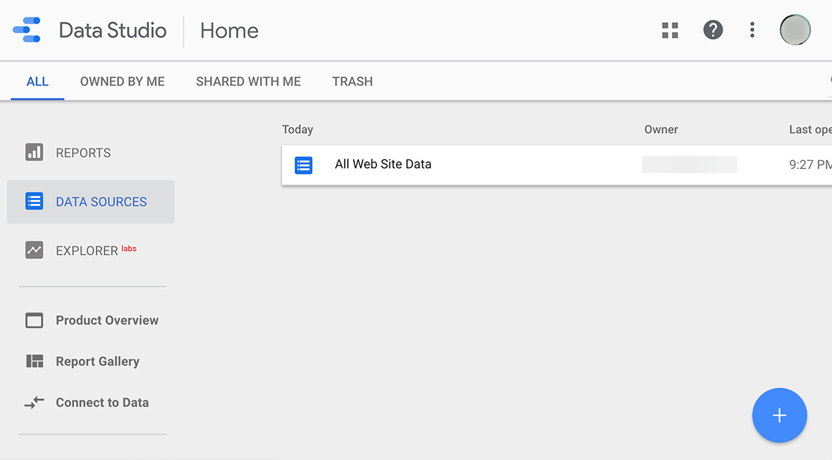
To build a dashboard in Google Data Studio, you start in Edit mode, which has a graph paper background where you drop visualizations such as tables, pivot tables, pie charts, or scorecards. When you’re done, you can see the dashboard visualizations in View mode and share them with your clients or colleagues. These visualizations show data from your data sources.
With the visualizations, you can see and interact with your data in the way that’s most useful to you. For instance, you could pull in all of your traffic sources and a table that shows how many goals are being achieved such as new leads. You could then add a drop-down menu that lets you break down the goals achieved by traffic source such as Facebook, Google Ads, or email.
In other words, Google Data Studio gives you more control over what data you see and how you see it. You can create tables that don’t exist or aren’t intuitive to create in Google Analytics. Add any variable you want to see and control the ways you can interact with the data. To demonstrate, to see mobile versus desktop, you add a button to the dashboard and see instant answers with a click.
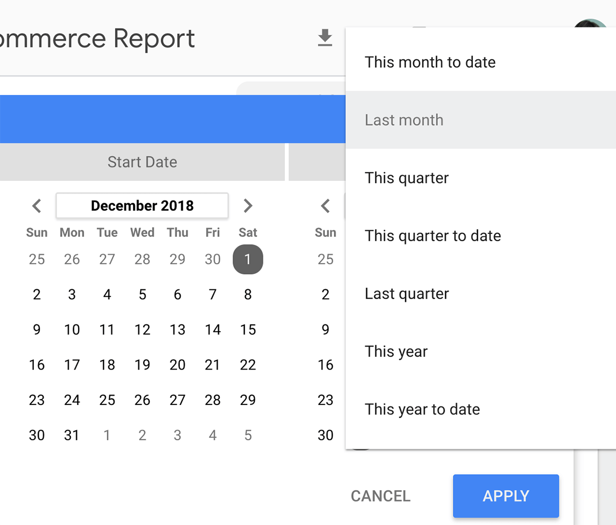
Date ranges are another interactive element. You can load data for certain date ranges so that anyone who views the dashboard sees the date ranges you specified. You can make the default date range the last 30 days, 14 days, or 7 days, depending on what you need. Then you can compare the range you specify to last year’s period so you can see trends in the data.
With all of these features, dashboards built in Google Data Studio help you select the data you need to see so you can determine what action to take. The real interaction isn’t just the drop-down menus, but the ease with which you can ask questions and use the customized dashboard to discover the answers. You can learn from your data and use what you learn to meet your marketing goals.
Dashboard Examples
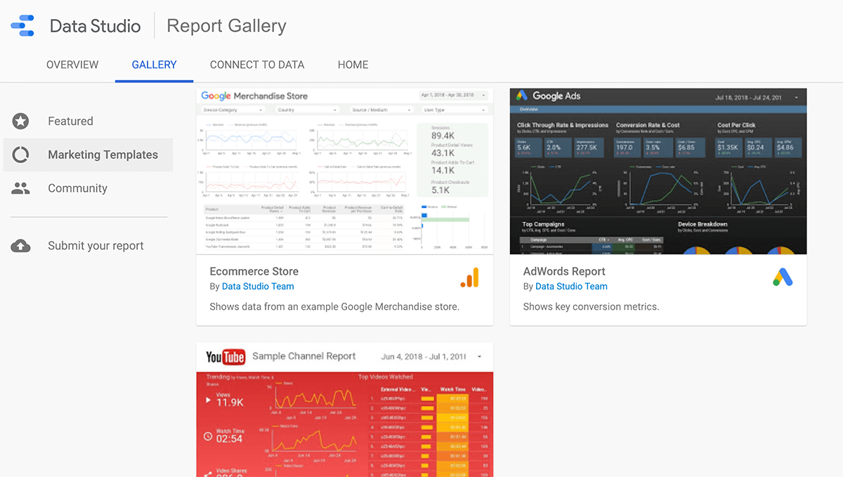
To see how other people build dashboards, check out the Google Data Studio Report Gallery, which is full of examples. Although you’ll find some that aren’t the best from a design perspective, You can finds value in seeing how others have built their reports and understanding what’s possible.
For the customer journey dashboard, the visualization is a funnel diagram that shows the number of people at each stage and the percentage of people who drop off from one stage to another. With a drop-down list for seeing specific traffic sources such as Facebook, email, or search, We can see which traffic source is good at each result in the funnel, such as engagement or purchases.
At a high level, you can create a customer journey dashboard like this by filtering the Source/Medium data from Google Analytics. But you could also build a dashboard that helps you do a deeper dive into your data. For instance, you might build a dashboard that uses UTM data to analyze Facebook traffic down to the ad level.
Data Sources in Google Data Studio
In Google Data Studio, you add data sources to a dashboard using connectors. The built-in Google connectors allow you to add Google-based data sources such as Google Analytics, Google Ads, Google Sheets, and so on. You can also choose from many partner and open-source connectors, which are created by the development community.
The community connectors give Google Data Studio a competitive advantage because they allow you to pipe data from all sorts of sources into Google Data Studio. These sources include Facebook, Instagram, popular email services, and more. For example, if you don’t want to use YouTube as a video stream, you can still use Google Data Studio to analyze your video data.
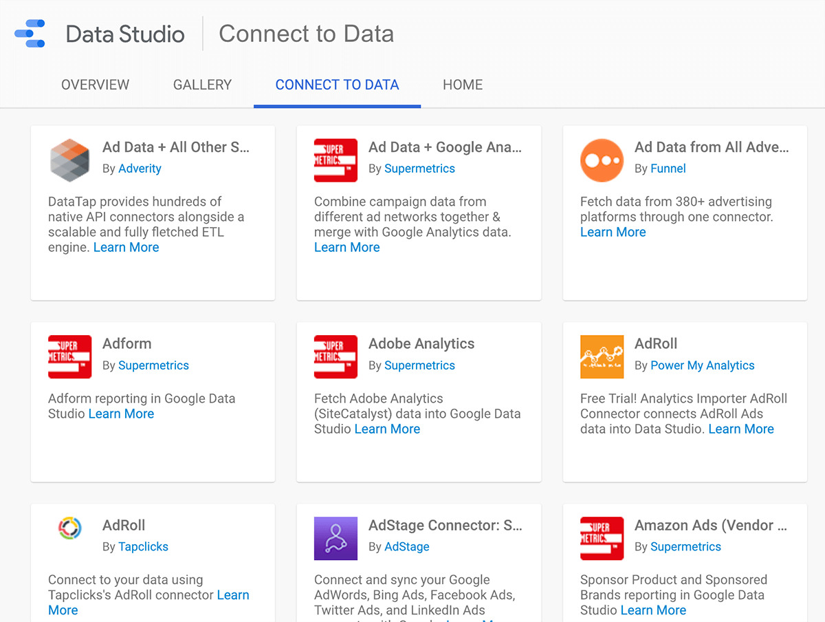
You can also find connectors for spreadsheets. Maybe you have spreadsheets your company has been using forever, but everybody hates them and doesn’t want to dive into that data. A connector could import that spreadsheet data into Google Data Studio. Then you could present the data in pretty interactive charts and diagrams that help people answer questions about your marketing.
To use the connectors, you don’t need to know a lot of high-end programming. All that’s built into the connector. When you build your dashboard, you can select some built-in connectors on the right or open a list of all of the available connectors and search for the one you’re looking for.
If you don’t see the connector you need, you can hire a developer to build it for you. To demonstrate, if your company uses a high-end customized database, you could build a connector so you can analyze that data in a Data Studio dashboard. If you need help finding a developer, try hiring one via a service like Upwork. You can also vote for developers to create a connector that interests you..
Supermetrics offers a great Google Analytics connector. If you have a lot of traffic in Google Analytics, you could have a sampling problem. The Supermetrics connector avoids or dramatically minimizes sampling.
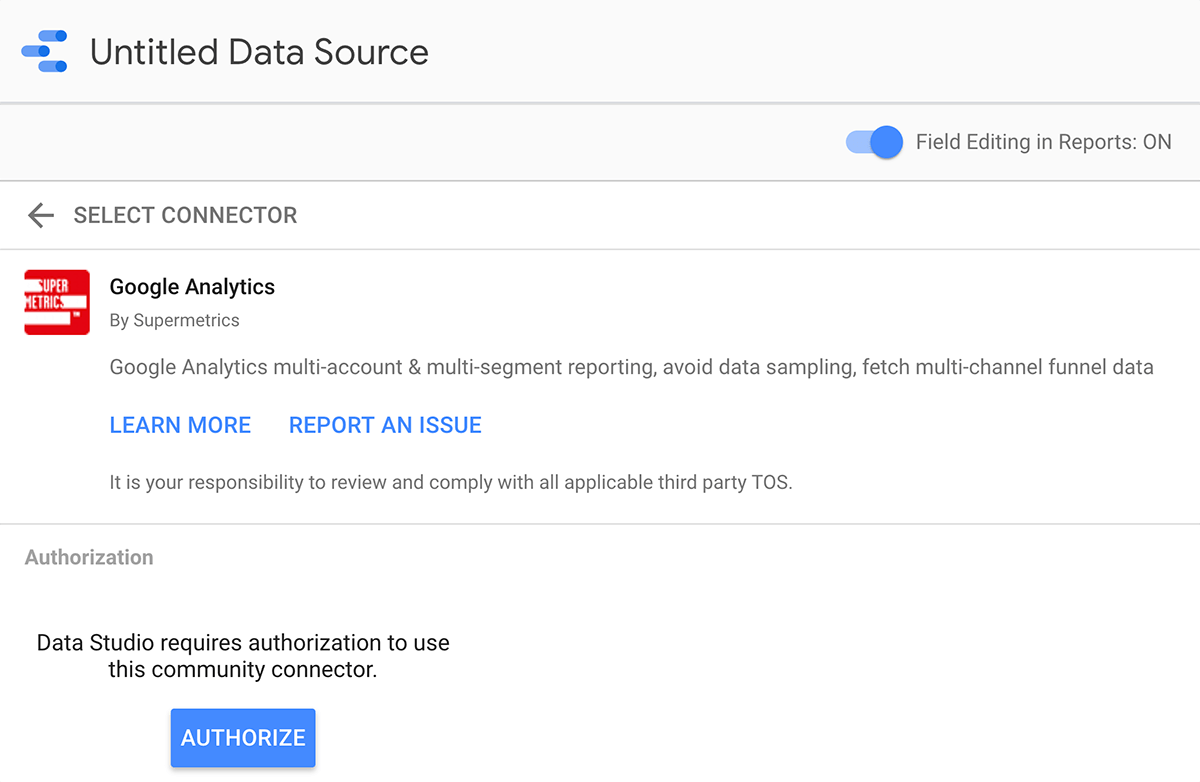
You’ll find both free and premium connectors. we recommends paying for connectors. Because application programming interfaces (APIs) change, you want to make sure the connectors you use are up to date. Supermetrics has a free plan and monthly paid plans that range from $20-$300 per month, paid annually, depending on what you need. We gets what he needs with the $99 plan.
Visualizations in Google Data Studio
Visualizations display data on your dashboard in a way that helps you interpret that data. A visualization might be a pie chart, line chart, bar graph, table, or pivot table. Google Data Studio also lets you add a scorecard, which is a number that you can display or calculate to answer a specific question you have. You can also find community visualizations in addition to the built-in ones.
Scorecards
A scorecard is just a number such as your eCommerce conversion rate, but you can do several things with it. For instance, you can set up the date widget so that the date is interactive. Then you can see last week’s rate or January’s rate by changing the date.
With blended data, a scorecard can use data to display a calculated field. This newer feature makes Google Data Studio a more robust dashboard tool. To illustrate, you could create a scorecard that shows cost per acquisition using ad spend data from Facebook and goals in Google Analytics.

Community Visualizations
Google Data Studio offers several ways to view data, but not every single type of visualization. However, developers can create their own visualizations and share them with the community. So if you don’t see the visualization you’re looking for, you can import one someone else created.
Excel has a gauge that’s like a little speedometer. Google Data Studio doesn’t offer that option. However, if a gauge is the best way to help you or your end user understand your data, you could look for one in the community visualizations or develop one.
Heatmaps
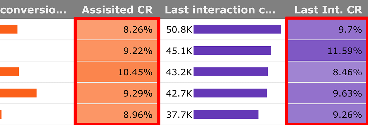
Heatmaps change the formatting of table columns to show how the column values are related. Imagine a table that lists your web pages and has a column for the number of users who visit each page. A heatmap could show your top 10 pages in red, middle-ranked pages in pink, and lowest-ranked pages in white. Then, you can see the hot part of a website at a glance.
Interactive Elements
Google Data Studio is keeping an eye on ways to make dashboards interactive. To demonstrate, instead of using a drop-down list to control how data is displayed in a dashboard, you can create tables with a clickable element that changes how the data appears. You might click the word “Facebook” to see only Facebook data in the tables.
How to Share Data From Google Data Studio
Google Data Studio is built on essentially the same infrastructure that Google Drive uses. When you share a Google sheet or a Google doc, you can give people view access or edit access, and type in email addresses to share a sheet or doc with different people. Google Data Studio has the exact same sharing mechanism so you can give different people different levels of access.
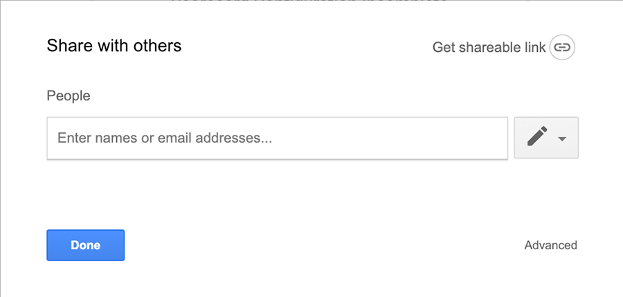
If you’re collaborating with someone to build a dashboard, you could give your collaborator edit access. However, if you’re sharing the dashboard with a client or department head, you can share the dashboard with view-only access. Then the user can interact with the dashboard and see all of the information, but they can’t access the back end and break something.
Google Data Studio recently added the ability to embed URLs. With this feature, you can share a YouTube video that shows somebody how to use the report. The video might explain the questions the dashboard can answer, or what the report can do or doesn’t do.
You can also download a snapshot of a dashboard as a PDF. Originally, Google assumed that everyone views the dashboards online, but agencies had trouble getting some clients to do that. So if you have clients who are used to PDFs, you can create a PDF of a dashboard every week or whenever you need it.
Tips for Getting Started in Google Data Studio
Everybody who has Google Analytics has the ability to sign in with that same email address, visit the Google Data Studio start page, and create their own dashboards. When you open Data Studio for the first time, you see a report that gives you a tour via an interactive dashboard that shows you around the interface.
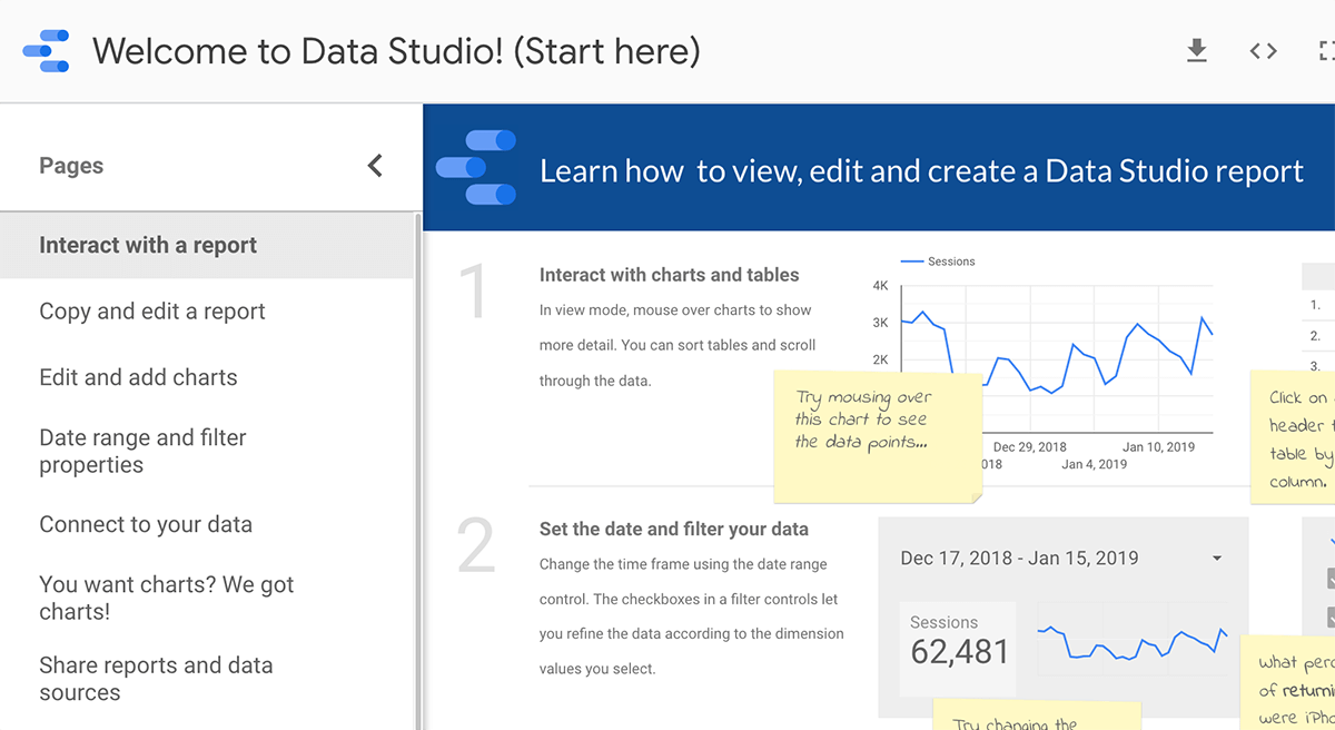
However, don’t expect to spend a day creating the perfect dashboard. There is no perfect dashboard. The dashboard you need right now gives you the answers that you want right now. As you continue interacting with your dashboard, you’ll begin asking more advanced questions that require more advanced customizations.
For dashboards that analyze data from Google, the built-in templates are a good place to start. You can find a YouTube channel report template, a search console template, a Google Ads overview template, and more. These templates are also a great way to figure out how to build a report. You can see how the templates combine visualizations and figure out how the dashboard shows a result.
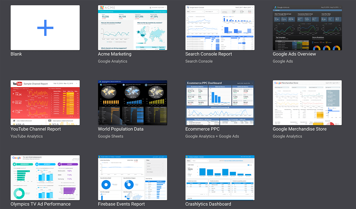
The Report Gallery is another good place to see example dashboards you can use as a starting point for building your own. When you click Report Gallery in the left-hand sidebar, you see designs people have submitted to share.
To use a template, make a copy of it. Then you can start making it your own. After you understand the basics, you can customize the template to answer specific questions about your business.
